The deliberate use of specific palettes has guided human emotions throughout art history. The world class painters did not select pigments merely for aesthetic realism or visual decoration. They understood the psychology of art in great works of art and used it as a powerful tool to communicate deep subconscious messages.
By manipulating hues, saturation, and contrast, artists evoke precise psychological responses from the viewer. Let's explore how five legendary artists utilize color psychology to create some of the most emotionally impactful masterpieces in human history.
Vincent Van Gogh: Blue And Yellow
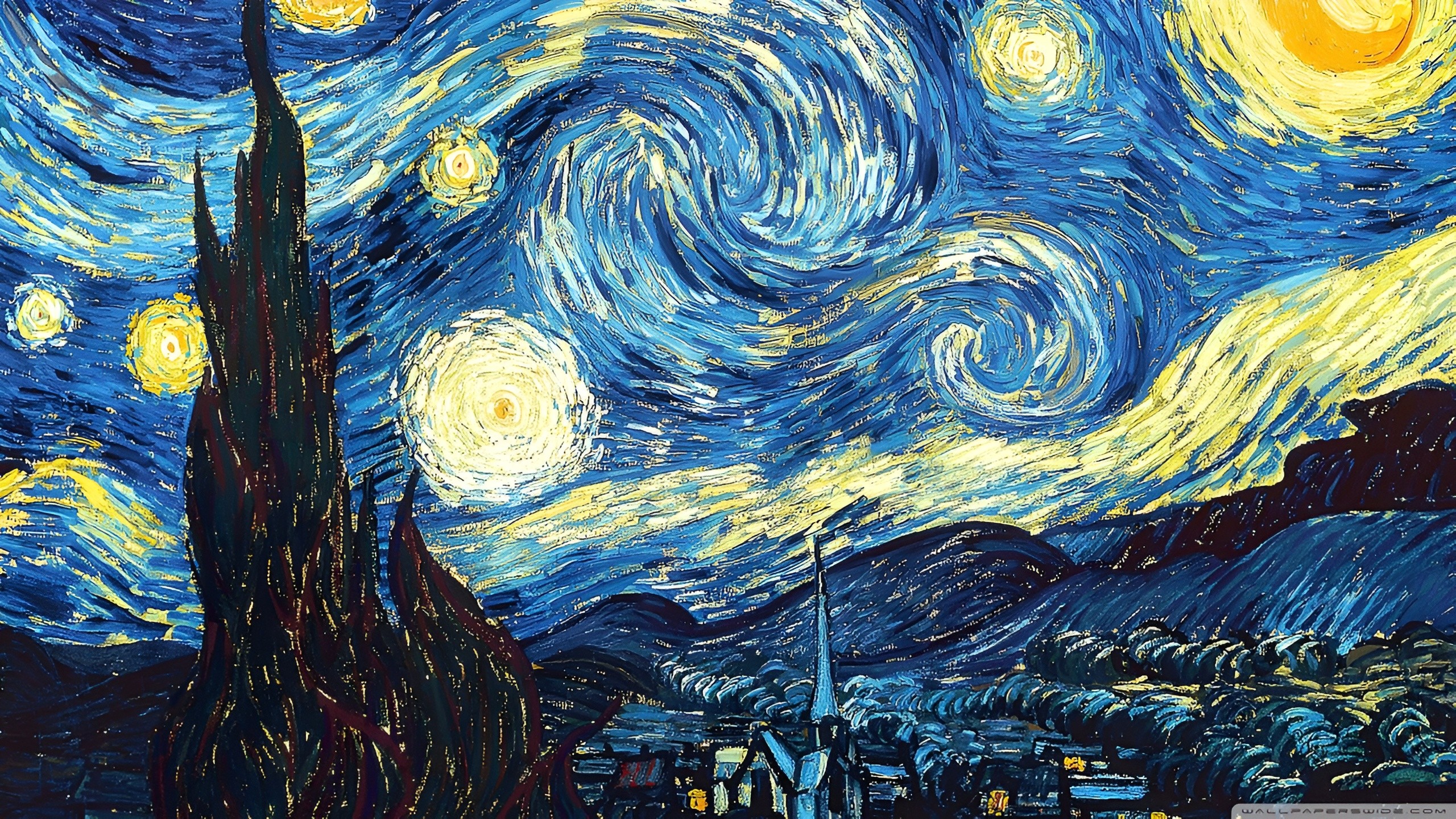
Vincent van Gogh used contrasting colors to express his turbulent internal psychological state. In his 1989 masterpiece, “The Starry Night,” the dominant combination of deep cobalt blue and vibrant zinc yellow creates a powerful emotional tension. In color psychology, the blue color typically represents calmness, stability, and melancholy, while the yellow color evokes energy, hope, and illumination.
The painting relies heavily on ultramarine and cobalt times to capture the quiet isolation of the night sky and the artist’s own mental solitude. However, the explosive, swirling yellow stars and crescent moon break through the darkness. This specific contrast provides a psychological sense of hope and spiritual vitality against a backdrop of deep depression.
Van Gogh famously noted that yellow was the color of the sun and life itself, using it as an emotional lifeline within his otherwise somber blue landscapes. Through this deliberate technique, his art became a therapeutic battlefield where light actively flight against his encroaching psychological darkness. Finally, these brilliant bursts of gold serve as a powerful testament to his unyielding desire for comfort and joy despite his immense suffering.
Also Read: How Social Media Algorithms Damage Teen Self-Esteem
Pablo Picasso: The Blue Period
Pablo Picasso’s “Blue Period” stands as one of the most famous examples of monochromatic color psychology in the entire art history. Between 1901 and 1904, he was deeply affected by the suicide of one of his close friends, which led him to paint almost exclusively in shades of blue and blue-green. For instance, his 1903 painting, “The Old Guitarist,” demonstrates how a restricted cool palette can evoke profound sadness, poverty and despair.
Psychologically, an overwhelming saturation of blue drains a composition of warmth, vitality, and life force. By stripping away from warm tones like red and yellow, Picasso’s paintings encourage the viewer to enter into a state of somber contemplation. The elongated, gray-blue figure of the blind musician blends into the background, signifying total societal isolation and extreme emotional exhaustion.
The only slight warmth appears on the brown guitar, which suggests that music is the subject’s sole remaining connection to survival. By painting the guitar in warmer times, he has beautifully illustrated the idea of how art and creative expression can serve as an emotional sanctuary during times of immense poverty. Therefore, this masterpiece reflects the artist's own profound empathy for the marginalized figures of society, providing them a timeless voice to their silent sufferings.
Edvard Munch: Red and Orange
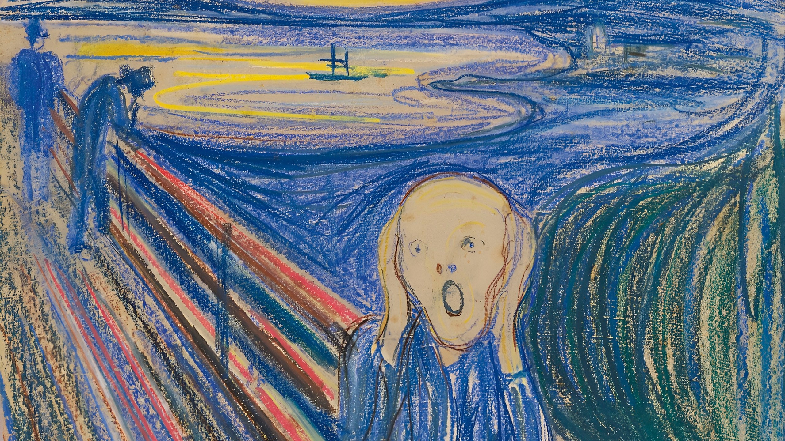
Edvard Munch brilliantly utilizes an aggressive, unnatural color scheme to capture an intense scene of human panic and existential dread. In his iconic 1893 work, “The Scream,” the sky is painted with violent, unnatural streams of blood red, crimson, and toxic orange. In the realm of psychology, red and orange are high-wavelength colors that trigger the autonomic nervous system, instantly increasing heart rate and alertness.
Munch used these fiery tones not to depict a literal sunset, but to project an internal psychic scream onto the external landscape. The claustrophobic intensity of the red and orange sky contrasts sharply with the murky, dark blue-black shades. This harsh juxtaposition creates an immediate visual disharmony, psychologically impacting the viewer. Through this raw distortion of reality, the painting stops being a simple depiction of a landscape and becomes an active, jarring echo of the artist's own internal panic.
While the warm colors do not comfort the viewer; instead, they signify danger, blood, amber, and overwhelming psychological anxiety. This aggressive use of color forces the viewer to confront a visceral sense of dread that feels deeply intimate yet universally understood. Finally, his composition master fully captures the modern existential crisis, transforming a passing moment of panic into an eternal, echoing monument of human suffering.
Also Read: The Prettiest Art Is Born From The Messiest Minds
Claude Monet: Violet and Green
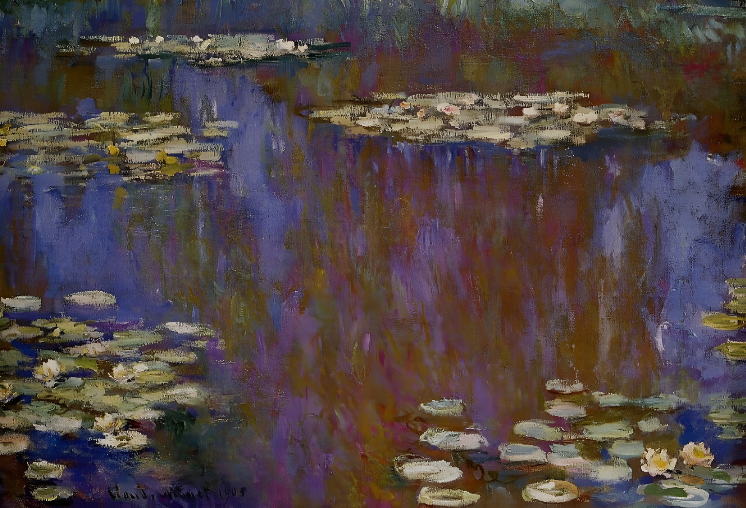
Claude Monet used a highly deliberate, harmonious palette to induce states of profound tranquility and meditative calm. Throughout his famous “Water Lillies” series, Monet relied heavily on combinations of soft violet, lavender, deep blues, and organic greens. According to color psychology, green color is highly associated with nature, renewal, and emotional balance, while the violet color encourages introspection, spirituality, and promotes mental peace.
Monet avoided harsh black lines and muddy earth tones, choosing instead to blend cool, analogous colors that mimic the natural behavior of light on water. The psychological result is an immediate lowering of stress levels and provides an open invitation to quiet contemplation. The most fascinating aspect of color psychology is that the gentle shifting between shades of green and violet creates a timeless, dreamlike atmosphere that stabilizes the viewer’s mood and mimics the restorative psychological effects of spending time in nature.
His signature fragmented brushstrokes allow these soft colors to visibly vibrate and interlock on the canvas, mirroring the natural movement of outdoor air and ripples. This innovative impressionistic technique completely strips away the rigid any structural boundaries, inviting viewers to fully immerse themselves in a soothing sensory experience. Finally, his mastery of light and color transforms the landscape into a meditative sanctuary, offering lasting mental tranquility to the viewer's mind.
Johannes Vermeer: Lapis Lazuli Ultramarine
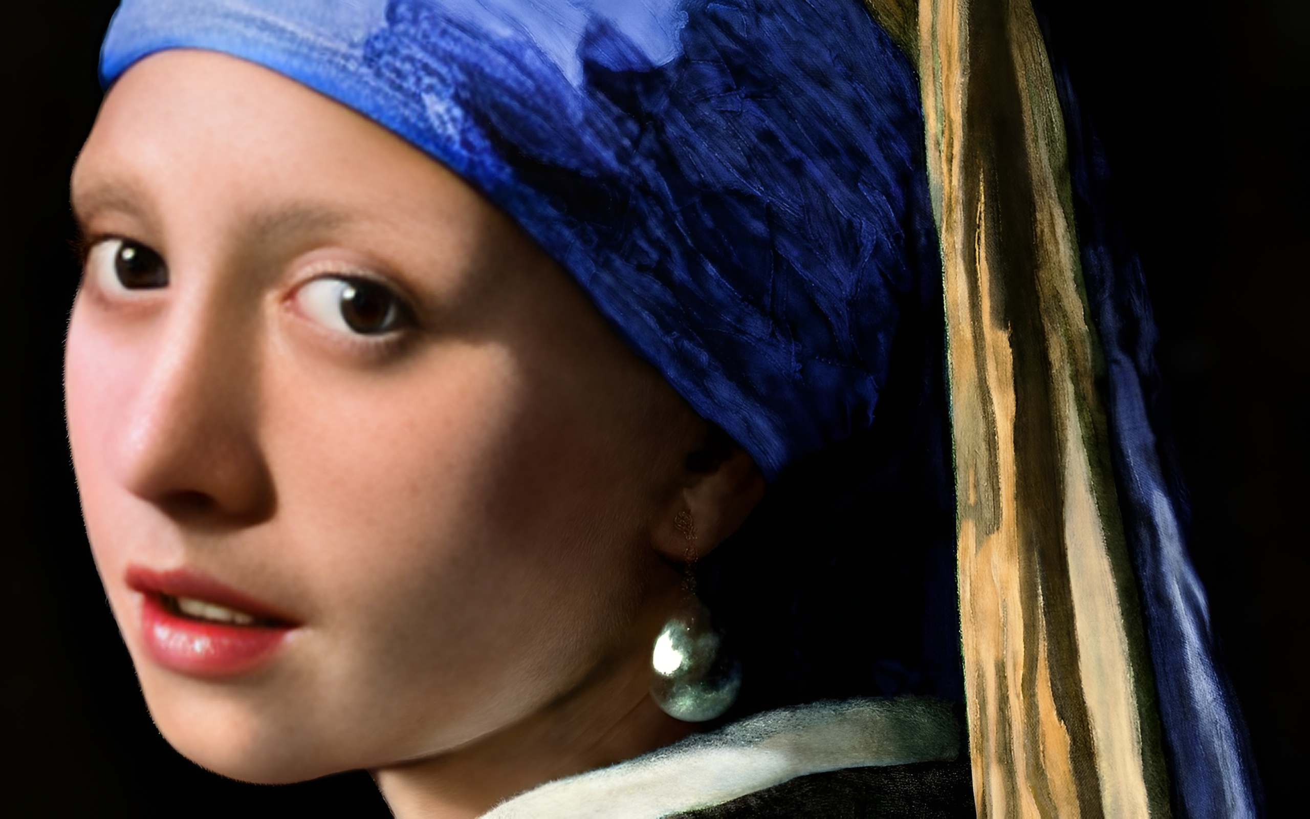
Johannes Vermeer utilised exceptionally rare and expensive pigments to elevate the psychological status and spiritual purity of his subjects. In “Girl with a Pearl Earring,” painted around 1665, the subject’s striking blue turban is crafted from natural ultramarine, a pigment made from crushed lapis lazuli. During the Baroque era, this pigment was more valuable than gold, traditionally reserved only for the robes of the Virgin Mary.
Psychologically, this specific share of deep, luminous blue conveys a sense of sacredness, infinite depth, and royal dignity. By placing this precious color against an intense, dark backdrop, Vermeer makes the blue appear to glow from within. The color draws the viewer’s eye directly to the girl’s gaze, creating an intimate, captivating psychological connection that feels both earthly and divine.
The artist has compelled the viewer to admire only the most essential features, the glimt of the pearl, the visible moisture on her lips, and the vibrant blue turban, stripping away from any unnecessary narrative distractions. This careful focus forces the observer to linger entirely on the subject's ambiguous expression, which seeks to fluctuate between innocence and profound knowing. His meticulous control over color choice and contrasting effects, has successfully ensured that the painting remains a timeless exploration of human mystery.
How Contemporary Artists Use Color Theory For Emotional Connection
Contemporary artists and modern visual designers continue to rely heavily on these established psychological principles to influence human behavior and emotions. While classical masters ground their work in oil pigments, modern digital artists, filmmakers, and interior designers use color theory to instantly set a narrative mood.
Even movie directors, for example, use highly specific color grading scales, such as cold blues for dystopian sci-fi or warm amber tones for conveying nostalgia to manipulate emotions subconsciously. Therefore, understanding how historical painters used color combination allows modern creators to build more impactful, resonant visual experiences today.