Colour is one of the most powerful elements in art. It can create mood, show emotion, attract attention, and make a painting feel joyful, frightening, peaceful, or mysterious. However, colour is not only about appearance. Every pigment has its own story. Some colours were discovered by accident, some were made from plants and minerals, and some were dangerous because they contained toxic materials such as lead and arsenic. The colours used by artists can help us understand their paintings more deeply.
A blue sky, a red dress, a white face, or a green landscape may look simple, but each shade can carry a long history. The pigment may have been expensive, rare, poisonous, or difficult to make. These facts often add new meaning to the artwork. This article explores seven colours: black, red, orange, yellow, green, purple, and white, and explains how they shaped famous paintings by artists such as John Singer Sargent, Johannes Vermeer, Claude Monet, Berthe Morisot, and James McNeill Whistler.
The Story of Prussian Blue
One of the most important colours in art history is Prussian Blue. It is a deep, rich blue pigment that became popular in the 18th and 19th centuries. It was used by many artists, including Hokusai, Pablo Picasso, Edgar Degas, and Claude Monet. Prussian Blue was discovered by accident in Berlin in 1706. A German occultist named Johann Konrad Dippel was trying to create a medicine that he believed could cure all human illnesses. He mixed wood ash and cow blood, but the experiment failed.
A dye-maker working nearby saw the mixture and decided to use it. He needed red dye, so he added crushed red beetles and heated the mixture. Instead of producing red, the experiment created a deep blue colour. The blue was beautiful and powerful, similar to ultramarine, which was one of the most expensive pigments in the world. Before Prussian Blue, artists often had to use ultramarine for strong blue colours. Ultramarine was made from lapis lazuli, a rare stone, and it could cost more than gold. Prussian Blue gave artists a cheaper and more available alternative.
Hokusai used Prussian Blue in The Great Wave off Kanagawa in 1831. The strong blue gives the sea a dramatic and dangerous feeling. Picasso also used blue tones in his early work, The Blue Room, in 1901. In both paintings, blue creates emotion, mystery, and depth. The history of Prussian Blue shows that accidents can change art. A failed experiment in a laboratory created a colour that later became important in some of the world’s most famous paintings.
Black
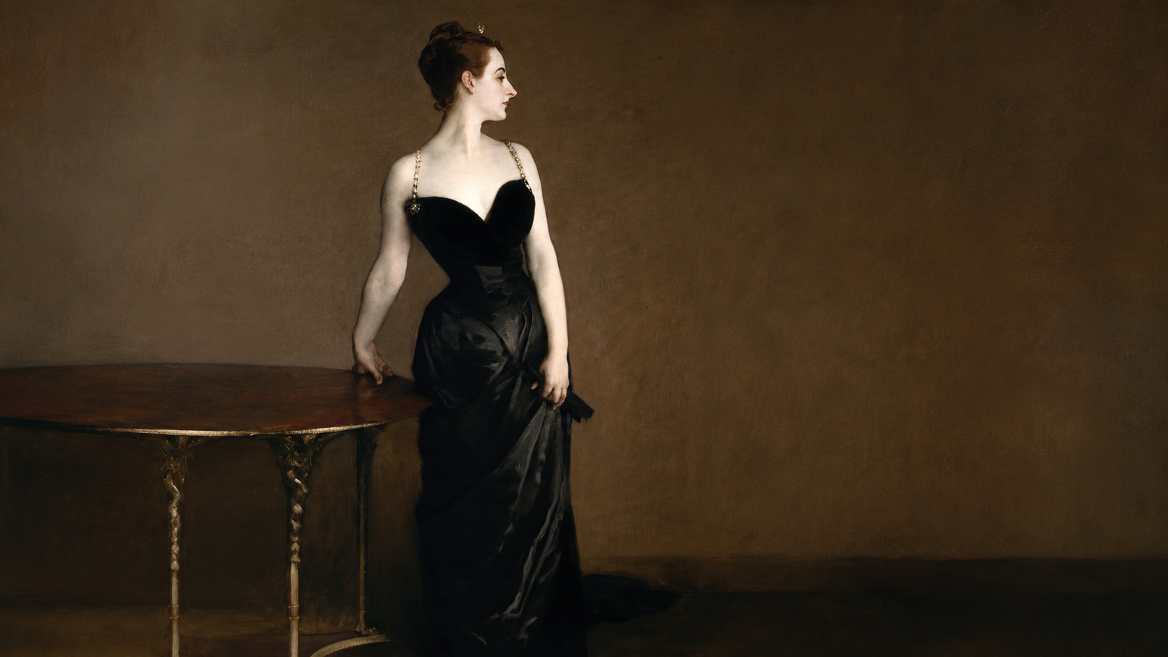
John Singer Sargent’s Madame X is one of the most famous portraits of the 19th century. It shows Virginie Amélie Avegno Gautreau, the wife of a wealthy French banker. When Sargent displayed the painting at the Paris Salon in 1884, it caused a major scandal. The original painting showed one strap of Gautreau’s black dress falling down her shoulder. At that time, many people thought this detail was too bold and suggestive.
Sargent later repainted the strap so that it rested properly on her shoulder. However, the painting is disturbing for more than this reason. Gautreau’s skin looks extremely pale, almost unnatural. Sargent created this effect by mixing several pigments, including lead white, rose madder, vermillion, viridian, and bone black. Bone black was traditionally made by burning animal bones.
The bones were heated until they became charcoal-like, then ground into a fine black pigment. Because of its connection to death and burned skeletons, bone black gives the painting a darker meaning. Gautreau’s pale skin appears beautiful but also unhealthy and ghost-like. The use of bone black makes the portrait feel like a reflection on beauty, desire, death, and decay. The painting seems to show that physical beauty does not last forever.
Also Read: Five Women Artists Whose Masterpieces Were Credited to Men
Red
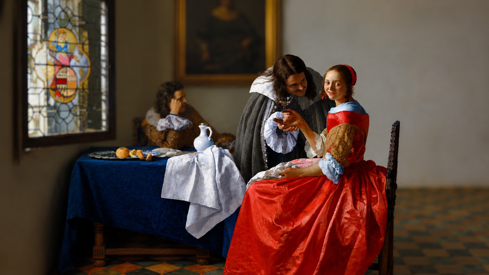
Johannes Vermeer’s The Girl with a Wine Glass shows a young woman sitting with a man who appears to be giving her alcohol. In the background, a chaperone sits in the corner and seems to be asleep. The scene feels uncomfortable because the man’s behaviour appears suspicious. The woman’s red dress is one of the most important parts of the painting.
Vermeer painted it using rose madder, a pigment made from the roots of a plant called Rubia tinctorum. The roots of this plant were boiled to release a red substance called alizarin. This substance could then be used to make a bright red pigment. Rose madder created rich shades of red that could look warm, deep, and powerful. The red dress makes the woman stand out. It gives her a strong presence in the painting.
Although the man is offering the drinks, the woman becomes the centre of attention because of the colour she wears. The red colour also creates tension. Red can suggest passion, danger, desire, and energy. In this painting, it makes the scene feels more intense and uncertain. The woman may appear to be in a vulnerable situation, but the powerful red dress gives her visual strength.
Orange
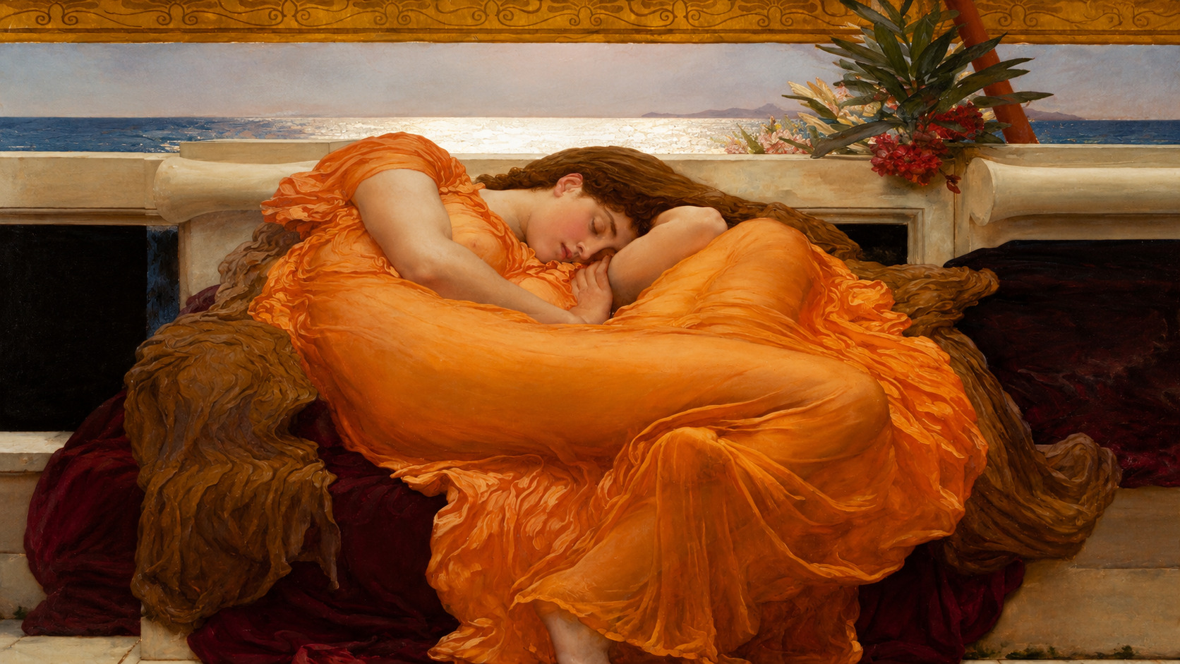
Sir Frederic Leighton’s Flaming June is a famous painting of a young woman sleeping in a bright orange dress. At first, the painting appears calm and peaceful. The woman seems to be resting on a warm summer day. However, the painting may have darker meanings. The woman lies below the horizon, which may suggest burial or death. Near her arm is a sprig of oleander, a poisonous plant.
These details make some viewers think that the painting is not only about sleep, but also about mortality. Leighton used chrome orange for the woman’s dress. Chrome orange was a relatively new pigment in the 19th century. It was made from chromite, a mineral found underground in places such as Paris and Baltimore, Maryland.
Chromite itself looked dull and dark, but artists and manufacturers could turn it into a bright orange pigment. This transformation from a plain mineral into a glowing colour adds meaning to the painting. The orange dress makes the woman look radiant and valuable. She appears less like someone who is dying and more like a treasure waiting to be discovered. The colour gives the painting warmth, energy, and a sense of lasting beauty.
Yellow
Yellow has always been important in painting because it can represent sunlight, wealth, gold, energy, and divine power. One important historical yellow pigment was lead-tin yellow. For many years, artists used lead-tin yellow, but the method of making it was eventually forgotten. By the middle of the 18th century, the pigment had disappeared from use.
In 1940, Richard Jacobi, a researcher at the Doerner Institute in Munich, discovered how the pigment was made. He found that heating lead monoxide and tin dioxide together in the correct amounts could create a range of yellow colours. These shades could vary from dark mustard yellow to pale, bright yellow. Artists such as Titian used lead-tin yellow in paintings like Bacchus and Ariadne.
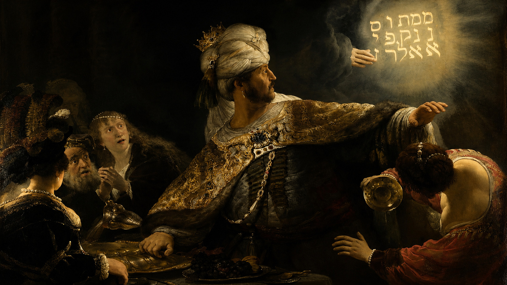
Rembrandt also used it in Belshazzar’s Feast, painted around 1636–38. In Rembrandt’s painting, the yellow pigment is used for the mysterious words that God writes on the wall. These glowing words are a key part of the story. They warn King Belshazzar that his rule is ending. The bright yellow makes the writing look supernatural and powerful. It gives the words a divine presence, as if they are glowing with light from another world.
Also Read: 7 Weirdest Buildings In Earth That Actually Exist
Green
Green often represents nature, life, freshness, and peace. However, some green pigments in art history were dangerous. Scheele’s Green was a bright green pigment that contained arsenic. It was used in wallpaper, clothing, and decorative objects during the 18th and 19th centuries. Some people believe that the wallpaper in Napoleon Bonaparte’s bedroom on Saint Helena contained Scheele’s Green and may have contributed to his death in 1821.
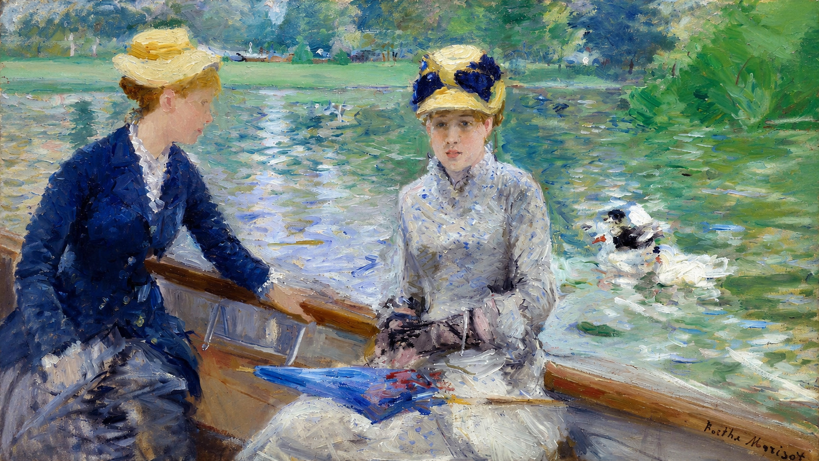
Later, the French Impressionist artist Berthe Morisot used emerald green in her painting Summer’s Day from 1879. Emerald green was similar to Scheele’s Green and also contained arsenic. The painting shows two young women sitting in a boat on the water. The scene looks peaceful, with soft light and reflections on the surface of the water. However, the green colour creates an uneasy feeling.
The green sky and water do not feel completely natural or calm. The colour seems restless and unstable. Because emerald green was toxic, its use adds a hidden sense of danger to the painting. Morisot’s painting reminds us that beautiful colours can sometimes have dark histories. The peaceful scene becomes more complicated when we know that the pigment itself was poisonous.
Purple
Purple became especially important for Impressionist artists in the 19th century. Before this time, purple pigments were difficult to make and were not always stable. Cobalt violet was one of the first purple pigments made specifically for artists. At the same time, portable paint tubes were invented. These tubes allowed artists to carry paint outdoors more easily.
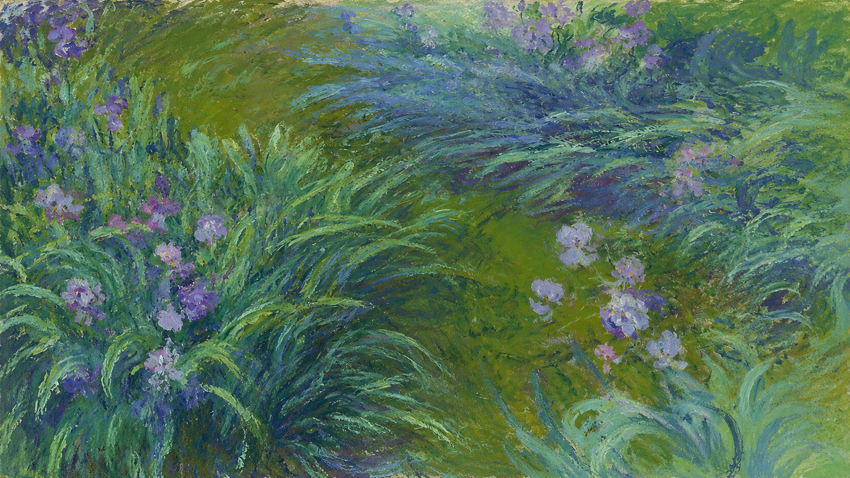
This was important for Impressionists because they wanted to paint directly in nature and capture changing light, weather, and shadows. Édouard Manet believed that violet was the true colour of the atmosphere. He reportedly said that fresh air was violet and that artists would soon begin using violet everywhere. Claude Monet was one of the artists who proved this idea correct. In his paintings of irises and water lilies, violet appears in shadows, flowers, water, and light.
Monet’s Irises, painted between 1914 and 1926, shows how colour can create atmosphere. The violet tones do not simply describe the flowers. They make the painting feel alive. The painting seems full of air, light, and movement. Cobalt violet helped Monet create a natural world that feels emotional and changing. The colour gives the painting depth and softness, making the viewer feel as if they are standing in the garden.
White
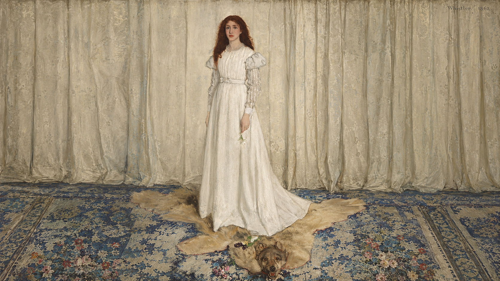
White often represents purity, innocence, peace, and cleanliness. However, one of the most common white pigments in art history, lead white, had a dangerous and unpleasant origin. James McNeill Whistler’s Symphony in White, No. 1: The White Girl appears to be a painting about purity. The title repeats the word “white,” and the painting shows a woman dressed in white clothing standing against a white background.
However, the white pigment used in paintings was often made through a dirty and toxic process. To create lead white, strips of lead were placed near vinegar inside a clay chamber. The chamber was surrounded by piles of fermenting animal waste. The vinegar reacted with the lead, while the animal waste produced carbon dioxide.
Together, these materials created a white layer on the lead strips. This layer was collected and turned into pigment. Lead white was bright and beautiful, but it was also poisonous. Artists and workers who handled it could suffer serious health problems. The Greek doctor and poet Nicander of Colophon described lead white as a “hateful brew” because it could harm the nervous system.
The history of lead white changes the meaning of Whistler’s painting. The painting looks clean and pure, but it was made with a pigment created from toxic lead, vinegar, and decaying waste. At the same time, this history gives the painting a hopeful message. Art can transform unpleasant and harmful materials into something beautiful. Whistler’s painting suggests that beauty can come from difficult or dark beginnings.